What needed to change
The existing presentation felt pieced together over time. Typography, colour usage, and asset styling lacked consistency, which made the brand feel less mature than the service quality behind it.
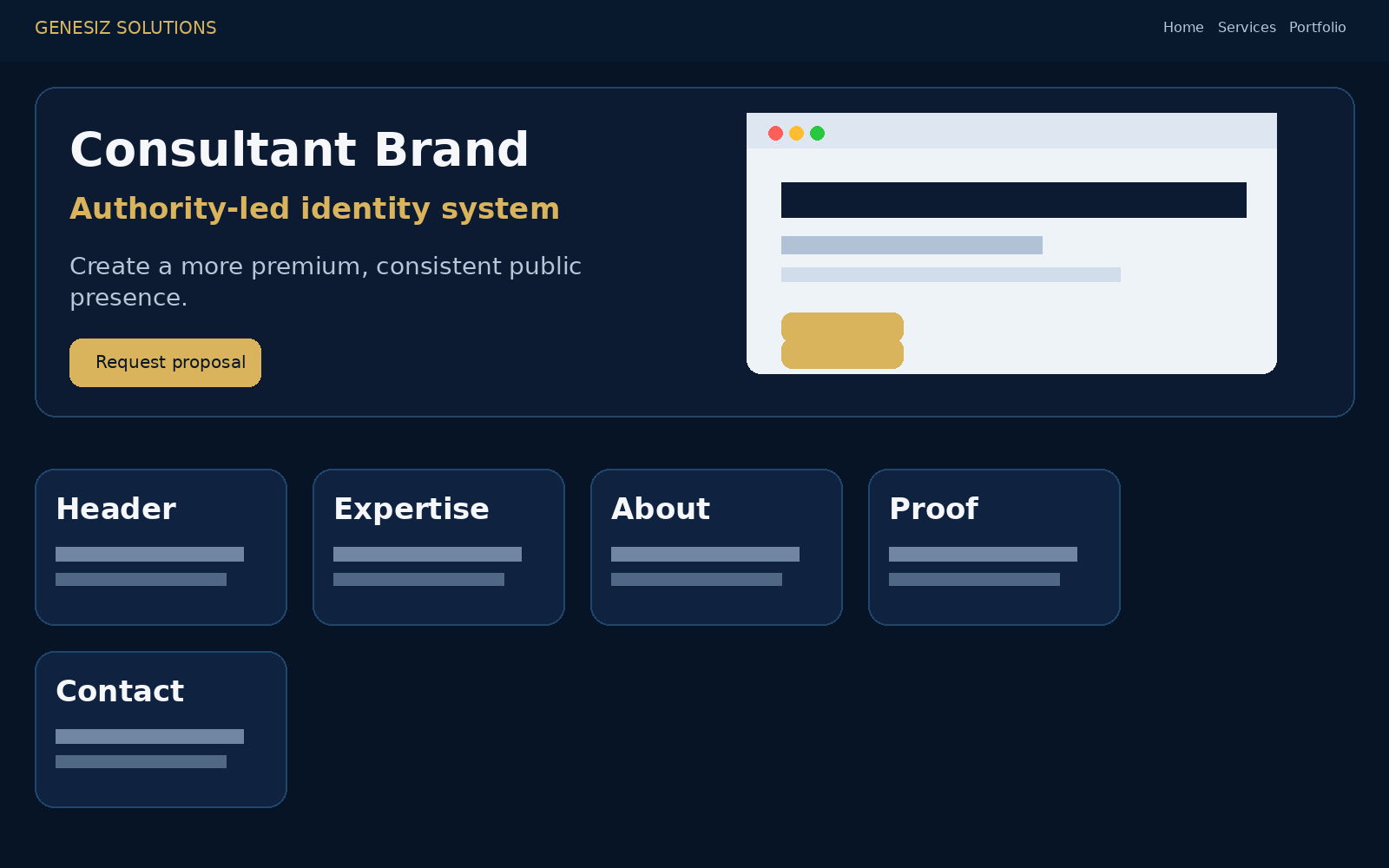
This project focused on making a personal brand feel more intentional, polished, and commercially credible. The visual system was refined so the business looked more established everywhere it showed up online.


The existing presentation felt pieced together over time. Typography, colour usage, and asset styling lacked consistency, which made the brand feel less mature than the service quality behind it.
These project visuals are presented in a polished, client-facing format so visitors can understand the direction, structure, and conversion logic at a glance.
The refreshed identity puts credibility first. It is cleaner, more cohesive, and easier for prospects to read as established.
This layer defines what makes the brand feel consistent beyond one logo or one page. That is what keeps the presentation strong over time.
The refreshed identity still needs to hold up on phones, where much of the audience first encounters it. This version does that better.
The before-and-after view makes the shift clear: less visual noise, stronger consistency, and a more confident overall presentation.

“The brand started feeling like one system instead of a collection of random assets.”
Personal brands often underestimate how quickly inconsistency reduces trust. A cleaner identity does not just look better; it reduces doubt.
Share the offer, audience, and business goal. You will get a clear next step instead of vague back-and-forth.