HomeServicesPortfolioAbout

Luxury interiors brand site repositioned for higher-value enquiries

A premium interiors business needed a website that finally matched the quality of its execution. The visual language, page flow, and enquiry path were rebuilt to attract better-fit prospects and make the brand feel more established from the first scroll.

Premium positioningService clarityLead-focused structure
Desktop presentation for luxury interiors website concept
The challenge

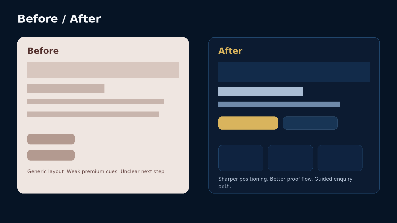
What needed to change

The business delivered high-quality interior work offline, but the digital presentation felt generic. Visitors could not quickly tell what kind of projects the brand handled, why it was premium, or how to take the next step. That gap between real-world quality and online perception was costing trust.

Strategic direction

How the project was shaped

  • Refocused the messaging around premium interior execution instead of broad, vague design language.
  • Restructured the homepage so visitors moved from positioning to portfolio proof to a clear enquiry action.
  • Used richer visual hierarchy, cleaner spacing, and stronger CTA placement to reduce passive browsing.
  • Built the flow to support both project-brief submissions and fast WhatsApp follow-up for warm leads.

Key screens and page moments.

These project visuals are presented in a polished, client-facing format so visitors can understand the direction, structure, and conversion logic at a glance.

Desktop presentation of interiors case study

Homepage hero and value framing

The top section is designed to establish quality, category fit, and a clean reason to enquire. No generic filler. Just the offer, the audience, and the next step.

Brand direction board for interiors case study

Portfolio and trust section

This section is where aspiration becomes believable. It gives the visitor visual confidence before asking for action.

Mobile presentation of interiors case study

Mobile enquiry flow

Premium service brands still lose leads on mobile when the page gets cluttered. The layout here keeps enquiry options simple and visible.

What changed visually and strategically.

A cleaner before-and-after comparison showing the shift from a generic layout to a more premium, guided enquiry path.

Before and after comparison for interiors case study
Deliverables
  • Homepage strategy
  • Service-page architecture
  • Responsive UI design
  • Project brief conversion path
Business impact
  • A more credible first impression for referral traffic and cold visitors alike.
  • Clearer service understanding for kitchen, full-home, and premium fit-out enquiries.
  • Stronger alignment between project quality and brand perception online.
  • An enquiry path that feels guided instead of improvised.
Project takeaway

“The site finally started looking like the level of client we wanted to attract.”

This type of project matters because premium buyers judge competence fast. A weak digital presentation can quietly lower perceived value before the first conversation even starts.

Let’s build a project page, brand system, or conversion-focused website that looks the part and sells the value.

Share the offer, audience, and business goal. You will get a clear next step instead of vague back-and-forth.