HomeServicesPortfolioAbout

Coaching offer landing page simplified to reduce friction before the call

This landing page was rebuilt around one commercial objective: get the right prospects to book a discovery call. The page structure cut distractions, lifted the offer higher, and handled objections before they killed intent.

Paid traffic supportOffer clarityMobile CTA flow
Desktop presentation for coaching landing page concept
The challenge

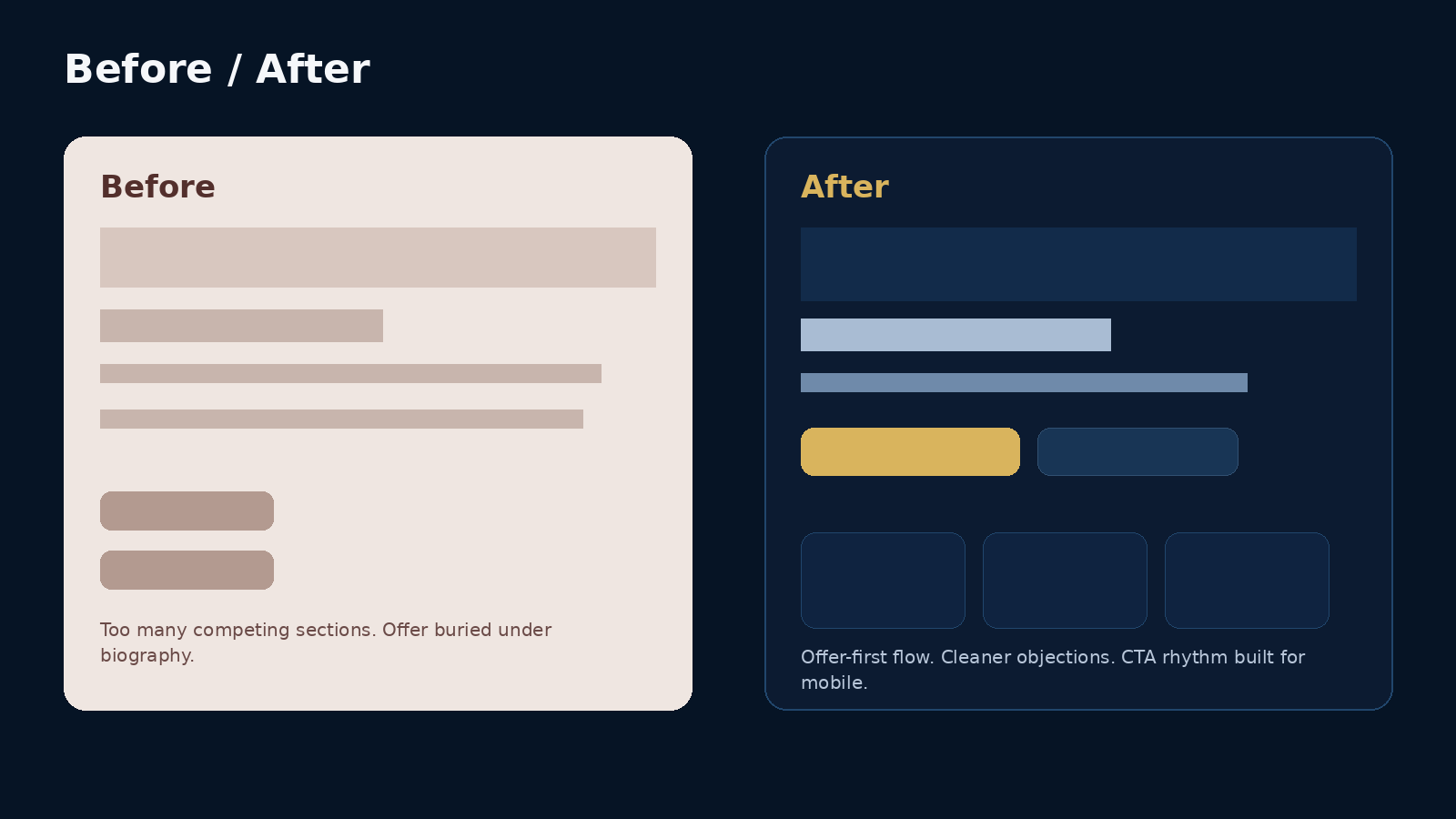
What needed to change

The original page was trying to do too much at once. It mixed biography, mindset content, pricing hints, social proof, and service explanation in a way that buried the offer. Traffic was arriving, but the page was asking prospects to work too hard to understand the next step.

Strategic direction

How the project was shaped

  • Reduced the page to a single dominant conversion path: book the call.
  • Moved the promise, audience fit, and expected outcome much higher on the page.
  • Added objection-handling sections, FAQ blocks, and more deliberate CTA repetition.
  • Optimised the mobile reading experience so the core message stayed clear from top to bottom.

Key screens and page moments.

These project visuals are presented in a polished, client-facing format so visitors can understand the direction, structure, and conversion logic at a glance.

Desktop presentation of coaching landing page

Offer framing above the fold

The hero section gets straight to the point: who the offer is for, what changes, and why the next step is worth taking now.

Brand board for coaching landing page

Objection-handling content

The page uses disciplined sections to answer hesitations before they turn into drop-off. That matters more than decorative filler.

Mobile presentation of coaching landing page

Mobile booking flow

The mobile version keeps the call-booking path visible and easy to act on, even for colder traffic.

What changed visually and strategically.

A direct comparison showing how the revised layout cut distraction, clarified the offer, and made the booking path easier to follow.

Before and after comparison for coaching landing page
Deliverables
  • Offer-page wireframe
  • Conversion copy refinement
  • CTA system
  • Lead capture form
Business impact
  • A tighter message-to-action flow for paid traffic.
  • Lower risk of drop-off caused by clutter and competing page goals.
  • A clearer pre-call experience that warms serious prospects before the sales conversation.
  • A landing page that supports the ads instead of leaking intent.
Project takeaway

“Once the page stopped trying to say everything, the actual offer became much easier to trust.”

Landing pages are not brochures. When traffic is paid for, every section needs a job. This rebuild focused on discipline, not decoration.

Let’s build a project page, brand system, or conversion-focused website that looks the part and sells the value.

Share the offer, audience, and business goal. You will get a clear next step instead of vague back-and-forth.